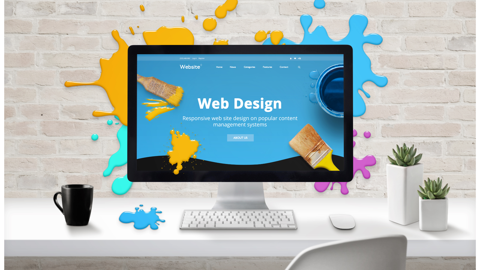
Website Design Nottingham: 10 Mistakes Costing Local Businesses Customers
Your website is often the very first impression a potential customer has of your business – and in a competitive city like Nottingham, first impressions are everything. Long before someone walks through your door, picks up the phone, or fills in an enquiry form, they’ve already sized you up online. They’ve judged your professionalism, your trustworthiness, and whether you’re worth their time, all in a matter of seconds.
The trouble is that many local businesses are quietly losing customers every single day because of avoidable website design mistakes. The site looks “fine” at a glance, so it gets left alone for years – while behind the scenes, visitors are bouncing away to a competitor with a slicker, faster, clearer website.
Good website design in Nottingham isn’t about chasing trends or winning awards. It’s about removing friction, building trust, and making it effortless for local people to choose you. In this guide, we’ll walk through ten of the most common – and most costly – website design mistakes we see local businesses make, and exactly what to do about each one. Whether you’re a tradesperson, a shop, a clinic, or a professional firm, fixing even a few of these could mean noticeably more enquiries, bookings, and sales.
1. A Website That’s Painfully Slow to Load
Speed is the silent deal-breaker. Research consistently shows that visitors abandon a website if it takes more than a few seconds to load, and on mobile that patience is even thinner. If your homepage crawls into view, a large chunk of your potential customers will have already tapped “back” and chosen a competitor before they’ve seen a single thing you offer.
Slow websites are usually caused by oversized images, bloated themes, too many plugins, cheap hosting, or code that’s never been cleaned up. The frustrating part is that the business owner often has no idea there’s a problem, because they’re loading the site from a cached version on their own device, where it feels perfectly quick.
Poor page speed doesn’t only cost you visitors – it also damages your rankings. Google uses loading speed as a ranking factor, so a sluggish site is harder to find in the first place. It’s a double penalty: fewer people see you, and those who do are more likely to leave.
The fix is to treat speed as a priority, not an afterthought. Compress and properly size your images, choose quality hosting, strip out plugins you don’t need, and consider a lightweight, well-built theme. A good website designer in Nottingham will run proper speed tests and optimise your site so it loads quickly on every device. It’s one of the highest-impact improvements you can make.
2. A Site That Isn’t Built for Mobile
More than half of all web traffic now comes from mobile phones, and for many local searches that figure is even higher. Someone standing on a Nottingham high street searching for a nearby café, plumber, or hairdresser is almost certainly doing it on their phone. If your website was designed for a desktop screen and simply squashed down to fit, those mobile visitors are having a miserable experience.
The symptoms are easy to spot: tiny text that needs pinching to read, buttons too small to tap, menus that don’t work properly, and content that spills off the edge of the screen. Every one of those frustrations gives a visitor a reason to give up and try the next business on the list.
Responsive design solves this by automatically adapting your website to whatever screen it’s viewed on, whether that’s a phone, tablet, or laptop. A mobile-friendly website reorganises itself so everything is easy to read, easy to tap, and easy to navigate with a thumb.
Google also champions mobile-friendliness, using a “mobile-first” approach to indexing and ranking. In other words, it judges your site primarily on how it performs on a phone. If you’re investing in website design in Nottingham, mobile responsiveness is non-negotiable – it should be the starting point, not a bonus extra.
3. No Clear Call-to-Action
It’s surprising how many local business websites leave visitors guessing about what to do next. The pages look attractive, the information is there, and then… nothing. No obvious “Book Now,” no “Get a Free Quote,” no prominent phone number. The visitor is interested but unsure how to take the next step, so they drift away.
A call-to-action (CTA) is the gentle but firm nudge that turns a curious browser into a paying customer. Every important page should guide the visitor towards a single, clear action that matches where they are in their decision. That might be calling you, requesting a quote, booking an appointment, or filling in a contact form.
The best CTAs are visible, specific, and repeated sensibly throughout the site. A bright button that says “Request Your Free Quote” works far harder than a vague “Contact” link buried in the footer. Telling people exactly what they’ll get removes hesitation.
Crucially, you shouldn’t make visitors hunt. Your primary CTA should appear near the top of the page, again partway through, and once more at the end, so that whenever someone feels ready to act, the next step is right in front of them. Strong website design in Nottingham is built around these conversion points – because a beautiful website that doesn’t prompt action is simply an expensive online brochure.
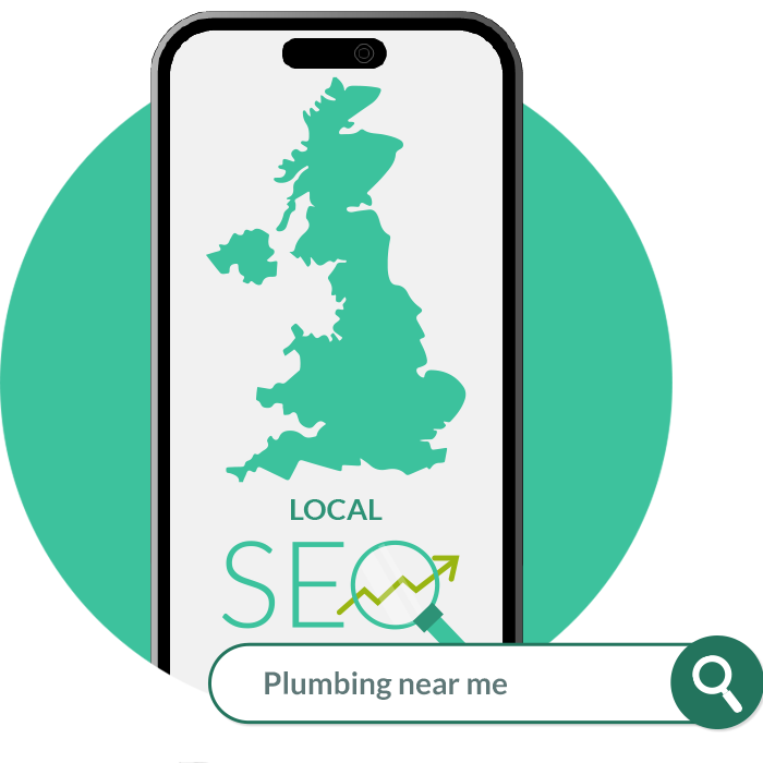
4. Neglecting Local SEO
You could have the most polished website in the city, but if nobody can find it, it can’t bring you customers. This is where local SEO comes in – and it’s one of the most overlooked aspects of website design for Nottingham businesses.
Local SEO is what helps you appear when someone searches “near me” or includes a location in their search, such as “accountant in Nottingham” or “emergency electrician NG1.” Getting it right means your business shows up in Google’s local results and on Google Maps, right when nearby customers are looking for what you offer.
Common mistakes include failing to mention your location naturally throughout your content, not having dedicated pages for the areas you serve, and ignoring your Google Business Profile entirely. Many sites don’t even include their full address, town, or service area in the text, leaving search engines unsure where the business actually operates.
The fix is to weave your location into your website thoughtfully – in your page titles, headings, content, and meta descriptions – without stuffing it awkwardly. Claim and complete your Google Business Profile, gather genuine reviews, and make sure your name, address, and phone number are consistent everywhere online. A website designer who understands local SEO will build these foundations in from the start, helping the right Nottingham customers find you rather than your competitors.
5. An Outdated, Tired Design
Design trends move quickly, and a website that looked smart five or six years ago can now feel distinctly dated. Old-fashioned fonts, clashing colours, clip-art style graphics, cramped layouts, and clunky stock photos all send an unspoken message: this business may be behind the times.
That impression matters more than many owners realise. Visitors form judgements about your credibility within milliseconds of a page loading, largely based on how it looks. Fairly or not, a tired design makes people quietly question whether the rest of your business is equally neglected – and they’ll often choose a competitor who simply looks more current and professional.
This doesn’t mean you need to chase every passing fad. A timeless, clean design tends to age far better than something flashy. What matters is plenty of breathing space, a clear and consistent colour palette, modern and readable fonts, and high-quality imagery that reflects your actual business rather than generic stock scenes.
A refresh also gives you the chance to align your website with how your business has grown. Many local firms have evolved their services, branding, and audience over the years, yet their website still reflects who they were a long time ago. Investing in modern website design in Nottingham keeps your online presence in step with the quality of service you actually deliver – and reassures visitors they’re in capable hands.
6. Confusing Navigation and Poor Structure
Even a beautiful, fast website will lose customers if people can’t find what they’re looking for. Confusing navigation is one of the most common and frustrating website design mistakes – and it quietly drives visitors away before they ever reach the information that would have convinced them to get in touch.
Problems creep in when menus are overcrowded with too many options, when labels are vague or clever rather than clear, or when important pages are buried several clicks deep. If a visitor has to think hard about where to go next, you’ve added friction – and friction loses customers.
Good navigation is intuitive and predictable. Your main menu should highlight the handful of things visitors most want: your services, your prices or quote process, who you are, and how to get in touch. Labels should say exactly what they mean, so “Our Services” beats something abstract or branded that only makes sense internally.
It also helps to think about the journey you want visitors to take. Guide them logically from understanding what you do, to seeing why you’re trustworthy, to taking action. A well-structured website feels effortless to move through, almost as if it’s reading the visitor’s mind. When people can find what they need quickly and comfortably, they stay longer, trust you more, and are far more likely to become customers.
7. Hiding Your Contact Details
It sounds almost too obvious to mention, yet countless local business websites make it surprisingly hard to get in touch. The phone number is tucked away in tiny text, there’s no email address, the contact form is broken, or the whole thing is hidden behind a single link that’s easy to miss. Every barrier between an interested visitor and contacting you is a potential customer lost.
Local customers in particular often want quick, direct contact. Someone with a burst pipe or an urgent appointment need isn’t going to dig through your site hunting for a number – they’ll simply call the next business that makes it easy. If your details aren’t immediately visible, you’re handing those enquiries to your competitors.
The fix is straightforward but powerful. Display your phone number prominently, ideally in the header so it appears on every page, and make it click-to-call on mobile so customers can ring you with a single tap. Include a clear, easy-to-find contact page with multiple options: phone, email, a simple form, and your address with a map.
It’s also worth listing your opening hours and the areas you serve, so visitors instantly know whether you can help them. Trust grows when a business is easy to reach and transparent about how to do business with them. Removing every obstacle between interest and contact is one of the quickest wins in website design – and one of the most frequently overlooked.
8. Thin, Unhelpful Content
Some websites say almost nothing. A few lines on the homepage, a sparse services page, and not much else. While clean and minimal can be a virtue in design, having too little actual content is a genuine problem – both for your visitors and for your search rankings.
Potential customers arrive with questions. What exactly do you offer? How does it work? What does it cost? Why should they choose you over the firm down the road? If your website doesn’t answer these questions clearly, visitors are left uncertain, and uncertainty rarely leads to a sale. They’ll head off to a competitor whose site explains things properly and makes them feel informed and confident.
Thin content also hurts your visibility. Search engines understand and rank pages based on their content, so a site with very little to say gives Google very little to work with. Well-written, genuinely helpful content – service pages that explain your offerings, answers to common questions, and useful local articles – gives search engines more reason to show your site and gives visitors more reason to trust you.
The goal isn’t to pad your pages with waffle. It’s to be genuinely useful: anticipate what your customers want to know and answer it in plain, friendly language. Strong content is one of the most valuable long-term investments in website design in Nottingham, quietly working to attract, inform, and convert visitors month after month.
9. Missing Trust Signals
When someone is deciding whether to spend money with a local business they’ve never used before, they look for reassurance. They want evidence that you’re reliable, that other people have had good experiences, and that you’re a real, credible operation. Trust signals provide exactly that – and many websites are missing them entirely.
The most powerful trust signal of all is social proof: genuine reviews and testimonials from happy customers. Seeing that other Nottingham residents have used and rated your service makes a prospective customer far more comfortable choosing you. Yet so many local websites either bury their reviews or don’t display any at all, leaving visitors to wonder whether anyone has ever actually used them.
Other valuable trust signals include relevant accreditations and memberships, awards, recognisable client logos, photos of your real team and premises, case studies, and any guarantees you offer. Even small touches help – a friendly “About Us” page with real faces does far more to build connection than an anonymous, faceless site.
Security matters too. A site without an SSL certificate (the padlock and “https” in the address bar) can trigger browser warnings that instantly frighten visitors away. Adding these trust signals throughout your website – not just on a hidden testimonials page – reassures visitors at the exact moments they’re deciding whether to act. In a competitive local market, that reassurance is often the difference between an enquiry and a missed opportunity.
10. Never Measuring or Improving the Site
The final mistake is treating a website as a one-off project rather than an ongoing asset. Many local businesses launch a site, breathe a sigh of relief, and then never look at it again. Without measuring how it performs, you’re flying blind – with no idea what’s working, what’s failing, or where customers are slipping away.
Tools like Google Analytics and Google Search Console reveal exactly how people find and use your website. You can see which pages attract visitors, where they come from, which pages they leave from, and whether they’re taking the actions you want. This information is gold. It shows you precisely where to focus your efforts for the biggest gains.
Without this insight, improvements become guesswork. You might assume your homepage is doing a great job when in fact most visitors abandon it within seconds, or that a service page is underperforming when it’s actually your strongest. Data replaces assumptions with facts.
The most successful local businesses treat their website as something that evolves. They review the numbers regularly, test changes, refresh content, and steadily improve their results over time. Small, ongoing tweaks – a clearer headline here, a better call-to-action there – compound into significantly more enquiries. Effective website design in Nottingham doesn’t end at launch; it’s a continuous process of learning what your customers respond to and giving them more of it.
Final Thoughts: Turn Your Website Into Your Hardest-Working Salesperson
Your website should be one of your most effective tools for winning new customers – working around the clock to attract, reassure, and convert local people who are actively looking for what you offer. Yet for far too many businesses, it’s quietly doing the opposite, leaking potential customers through slow loading times, clumsy mobile experiences, unclear calls-to-action, weak local SEO, and a tired design that undersells how good they really are.
The encouraging news is that every one of these mistakes is fixable. You don’t necessarily need to start from scratch – often a focused round of improvements can transform how your website performs. Begin with the issues most likely to be costing you customers right now: speed, mobile-friendliness, clear calls-to-action, and easy contact. From there, strengthen your local SEO, sharpen your content, add trust signals, and commit to measuring and improving over time.
If you’re not sure where your website is falling short, a professional review can quickly pinpoint the weak spots and the quickest wins. Great website design in Nottingham is ultimately about respect – respecting your visitors’ time, answering their questions, and making it genuinely easy to choose you. Get those fundamentals right, and your website stops being a missed opportunity and becomes your hardest-working salesperson.
Want to know which of these mistakes might be costing your business customers? Get in touch today for a friendly, no-obligation review of your website.

 Book A Call